Is nostalgia memory… or vision?
Designed to change how you see
I keep coming back to this question, usually without meaning to.
Is nostalgia something we remember, or something we see?
Because the more I pay attention, the more it feels like sight comes first.
We don’t miss old technology in the abstract. We miss how it looked. The glow of a screen. The grain of a photo. The weight of a device in the hand.
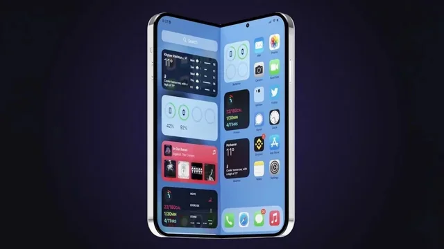
At CES 2026, the device that got the most attention was a camera that looks like something from 1965. Samsung's Galaxy Z TriFold won Best Overall, a phone that unfolds into a 10-inch tablet, which is genuinely wild.
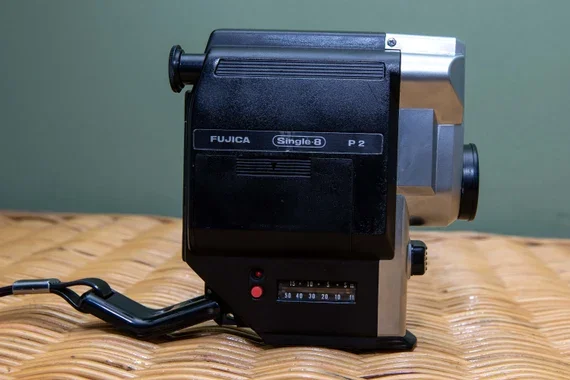
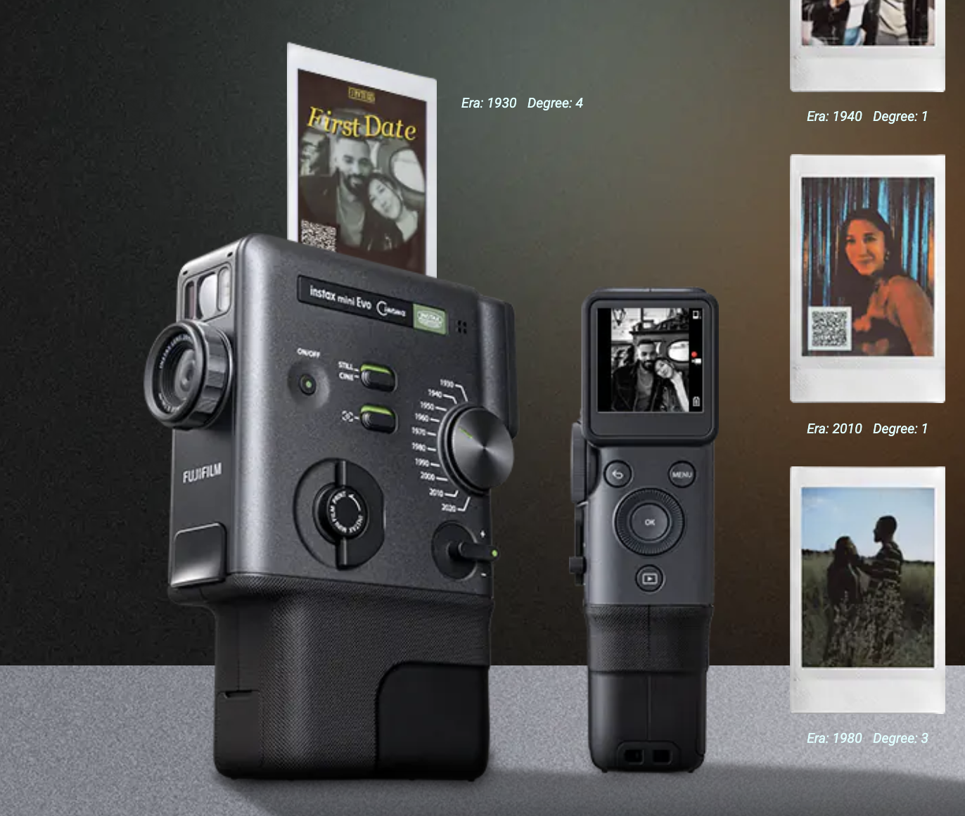
But the one that stayed with me was Fujifilm's instax mini Evo Cinema.
It's this handheld instant camera modeled after Fujifilm's own Fujica Single-8 cine camera from 1965. Sixty years ago. It shoots video. It prints instant photos. And it has this dial called the Eras Dial that applies the visual texture of different decades: the grain of 1930s film, the color bleed of 1970s CRT televisions, the crispness of the 2020s. You twist the dial, and the image shifts through time.
It admits that memory is visual before it’s factual. That when we think about the past, we’re really thinking about light, color, texture, and atmosphere.
This isn’t new.
In the 1940s and 50s, color in technology was instruction. Red meant stop. Green meant go. Vision was about safety and coordination. Later, as machines became abstract, color became a proxy for state. Little lights told you something was happening even when you couldn’t see the system itself.
Then tech entered the home and softened. Color warmed. Devices had to coexist with couches and family photos. Vision shifted from control to comfort.
The late 90s took it further. Color became identity. Translucent plastics, Bondi Blue, devices that asked who you were instead of just what you needed. That wasn’t nostalgia yet. It was presence.
The nostalgic eye
Old technology keeps coming back, not as replicas, but as reinterpretations.
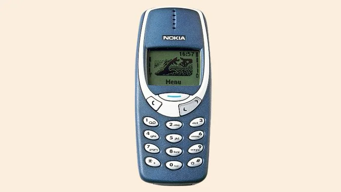
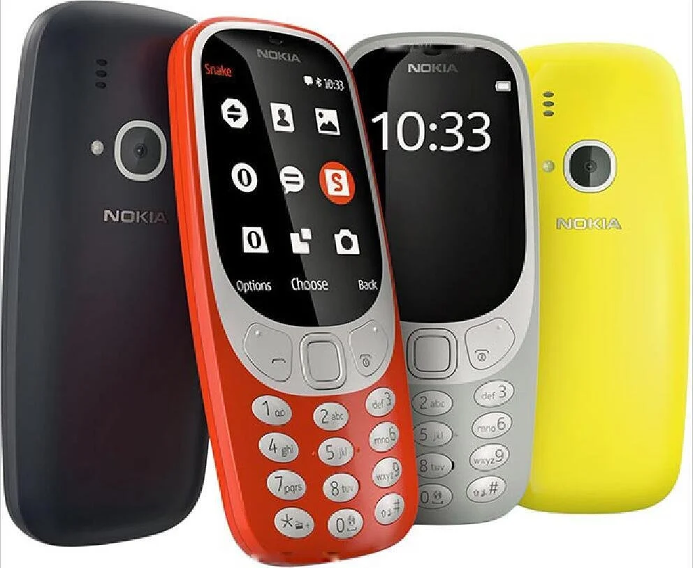
The Nokia 3310 didn’t come back because it was technically superior. It came back because it looked familiar.

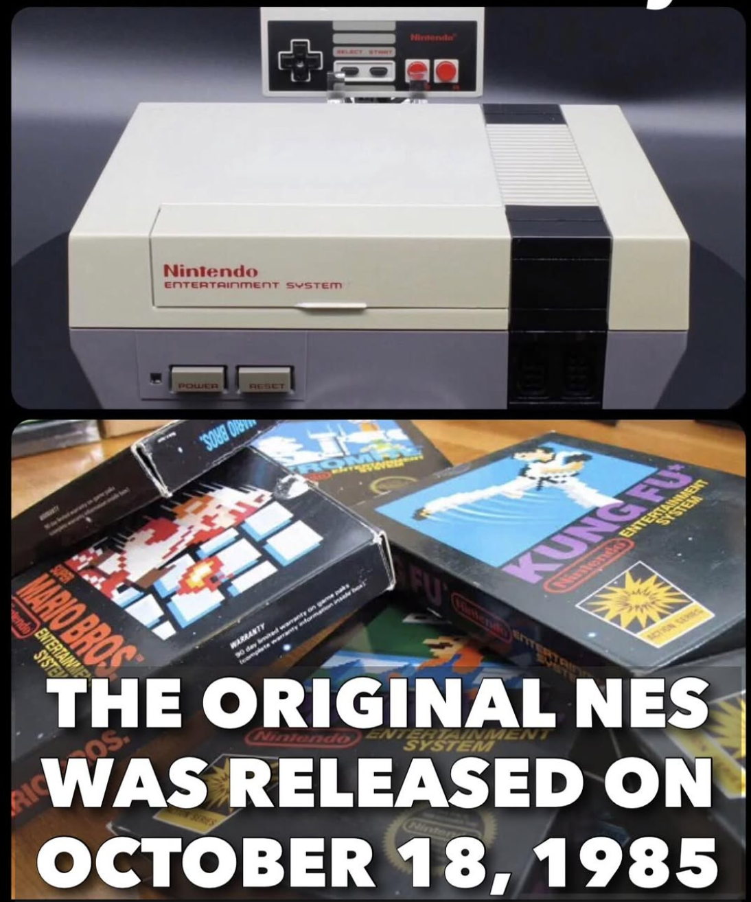
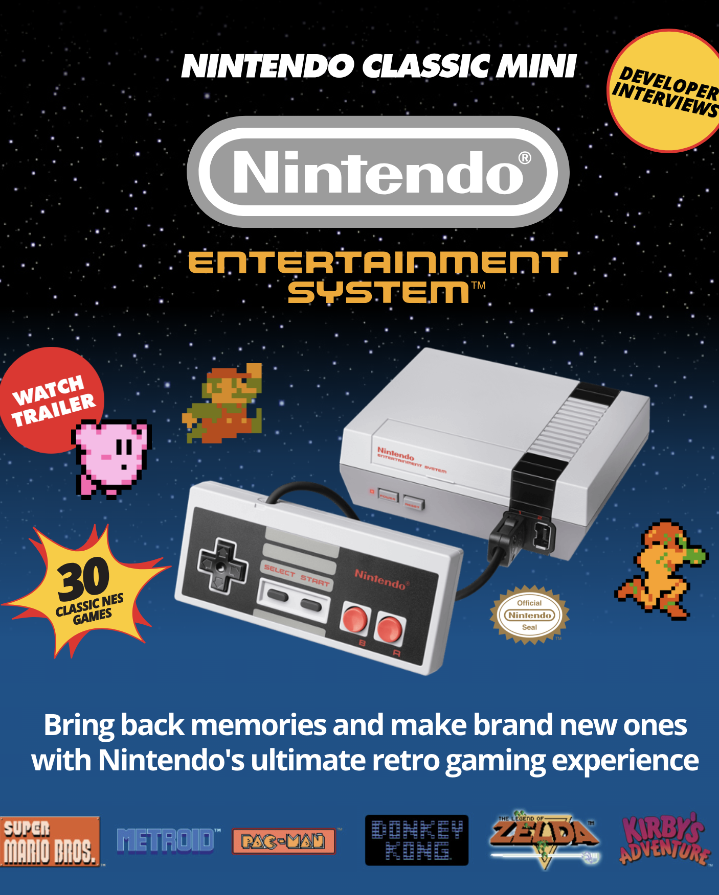
The NES Classic became the best-selling console of 2016's holiday season because people needed to feel something familiar again. Nintendo and Nokia understood something important: they were selling memory.
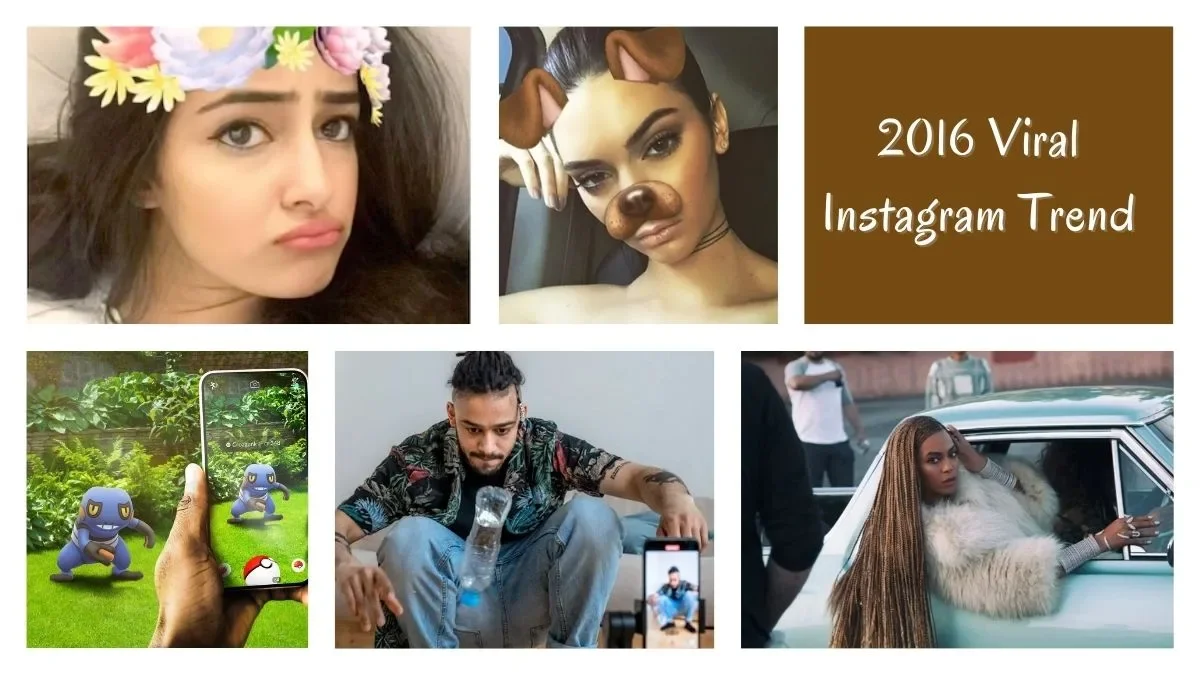
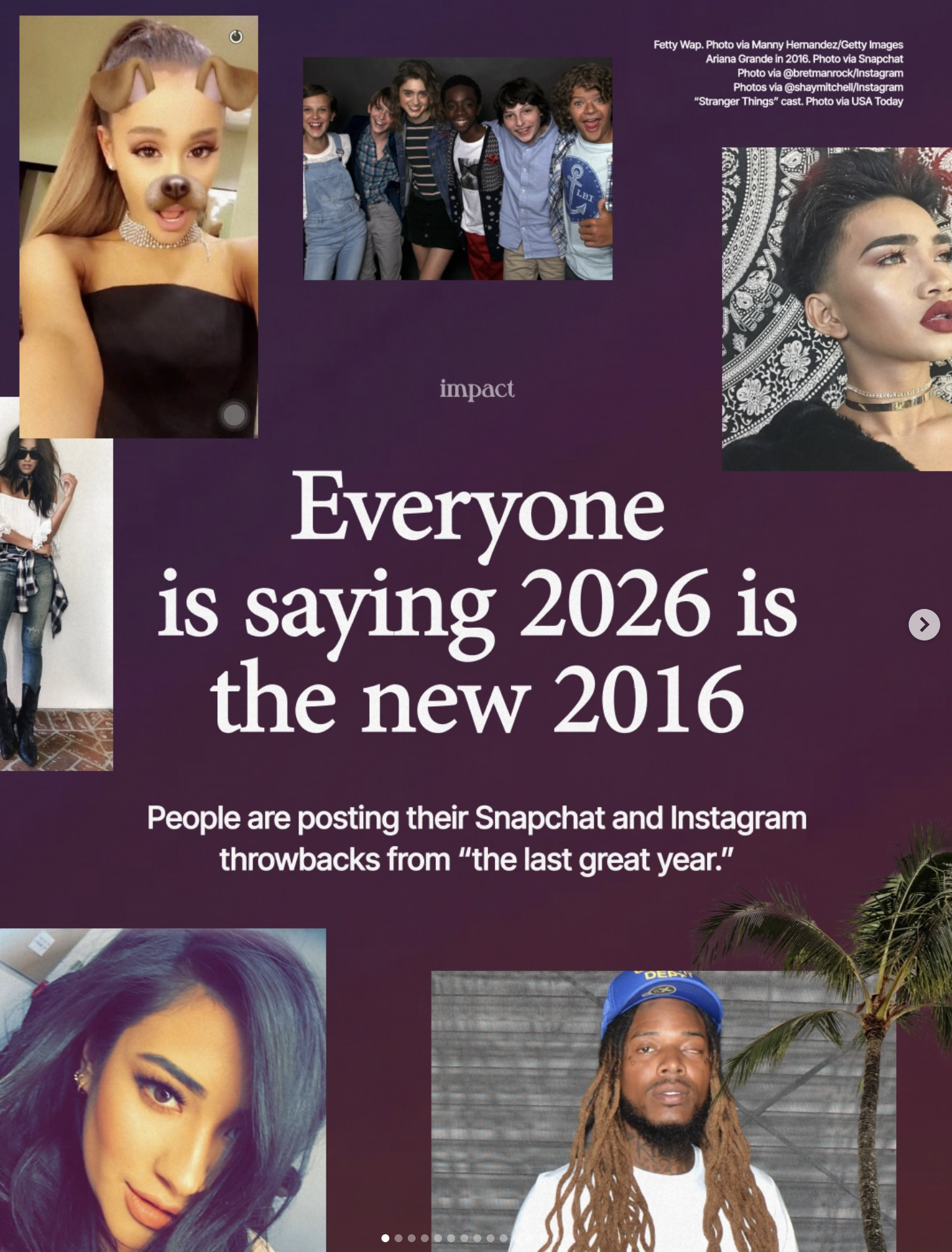
Even Instagram trends like “2026 is the new 2016” aren’t really about the year. They’re about the look of that time. Chronological feeds. Blurry photos. Filters that didn’t feel strategic. Nostalgia shows up as a visual compression of a feeling we don’t know how to describe otherwise.
The value and identity of technology
There’s actually a name for this pattern.
Ryan Raffaelli, a researcher at Harvard Business School, has a term for this: technology re-emergence. He studied Swiss mechanical watches, nearly wiped out by quartz in the 1970s, and noticed something counterintuitive. Some technologies come back stronger after they’ve been declared obsolete.
The reason wasn’t technical. It was visual and symbolic.
Swiss watchmakers stopped competing on accuracy. They stopped asking people to care about precision. Instead, they reframed mechanical watches as craftsmanship, heritage, and ritual. The value shifted from how time is measured to how time is seen.
That distinction matters.
It’s why instant cameras still matter. The delay of an instax print is a visual pause. A moment where seeing slows down. And it’s why color is coming back now, not loudly, but deliberately.
For a long time, tech tried to disappear. Silver. Black. Matte. Invisible. Devices were designed to signal seriousness, authority, neutrality. But once technology became ambient, once it filled our homes and our days, neutrality stopped being neutral.
When something is always in your peripheral vision, how it looks starts shaping how you feel.
Color returns because people want orientation. They want to choose the feeling of their environment, not just the function of the device. Vision becomes a way of asserting agency in a system you can’t open or modify anymore.
Color is "back"
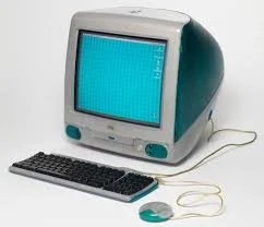
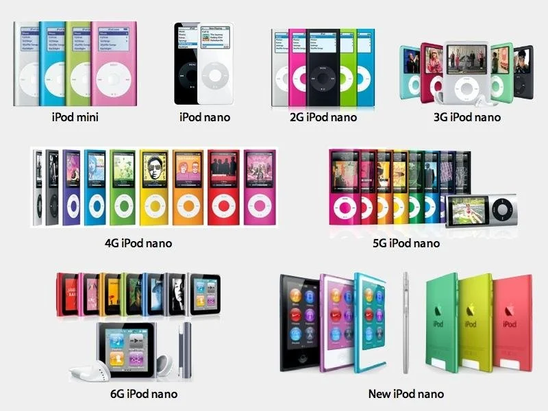
This feels like a direct echo of the late 1990s and early 2000s, when technology embraced color as visual identity. The iMac G3 in Bondi Blue. The rainbow of iPod nanos. Nokia phones in every hue. Then the iPhone arrived (monochrome, restrained) and the industry followed. For nearly two decades, color became a novelty, reserved for cases and accessories.
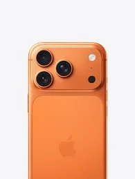
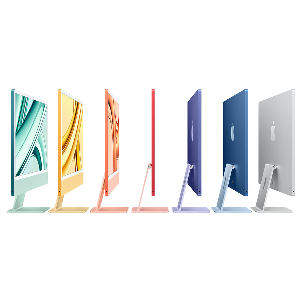
Now it's returning. Apple's 24-inch iMac offers seven colors. The iPhone 17 Pro launched in Cosmic Orange: a bold, saturated hue that would have been unthinkable on a Pro device five years ago. The low-cost MacBook rumored for 2026 might come in silver, blue, pink, and yellow.
Bouroullec put it beautifully: "Even in silence, they will blend naturally into everyday life. Their quiet presence shapes the atmosphere around you."
Devices that inhabit a room, with personality, with intention, with color.
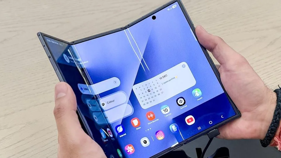
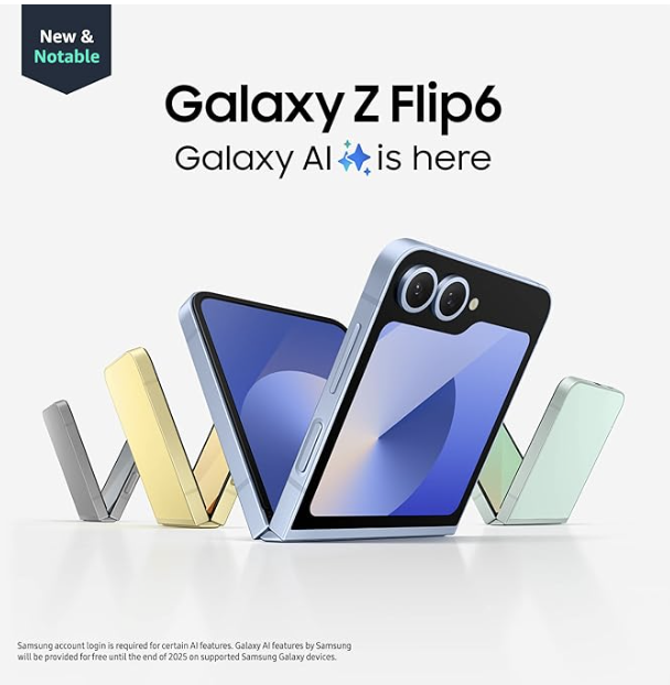
Folding tech and visual memory
The same thing is happening with form.
Foldable devices pull attention before specs ever do because they trigger visual memory. Opening and closing used to be normal. Flip phones. Compact cameras. Camcorders. Technology once changed shape as you used it. Then everything flattened into glass.
Folding tech brings movement back. Watching a device unfold feels old and new at the same time. Our eyes are wired to notice transformation. Earlier tools understood this intuitively. Modern tech forgot it.
That’s why foldables feel compelling even before they feel practical. They signal function through motion. They make state visible again. This is also why rumors around a restrained, book-style foldable iPhone hit differently (iFold). The appeal isn’t size. It’s clarity. Clear states. Clear transitions. A device that shows you what it’s doing by how it moves.
Sight shapes memory
This is what I keep returning to.
The past holds visual templates we haven’t finished working through. The instant camera. The flip phone. The mechanical watch. The colorful computer. Not because the past was better, but because its visual language still explains something we need now.
Trends like “2026 is the new 2016” are about how that time looked. Chronological feeds. Blurry photos. Less strategy. More presence. Somewhere along the way, we stopped paying attention to how things looked and focused only on what they did.
But sight shapes memory.
And memory shapes what we build next.
Which brings me back to the question.
When we say we’re nostalgic, are we remembering the past,
or are we responding to how it once appeared to us?
I think vision gets there first.
Thank you for thinking with me. This piece is part of Ode by Muno, where I explore the invisible systems shaping how we sense, think, and create.
The quote at the intro is from the book, Systems Intelligence.