An interactive visualization of 49 products from CES 2026, mapped by how they reach you—through sight, sound, touch, taste, scent, space, time, and the systems that connect them.
Live Site: ces2026-sensory-graph.netlify.app
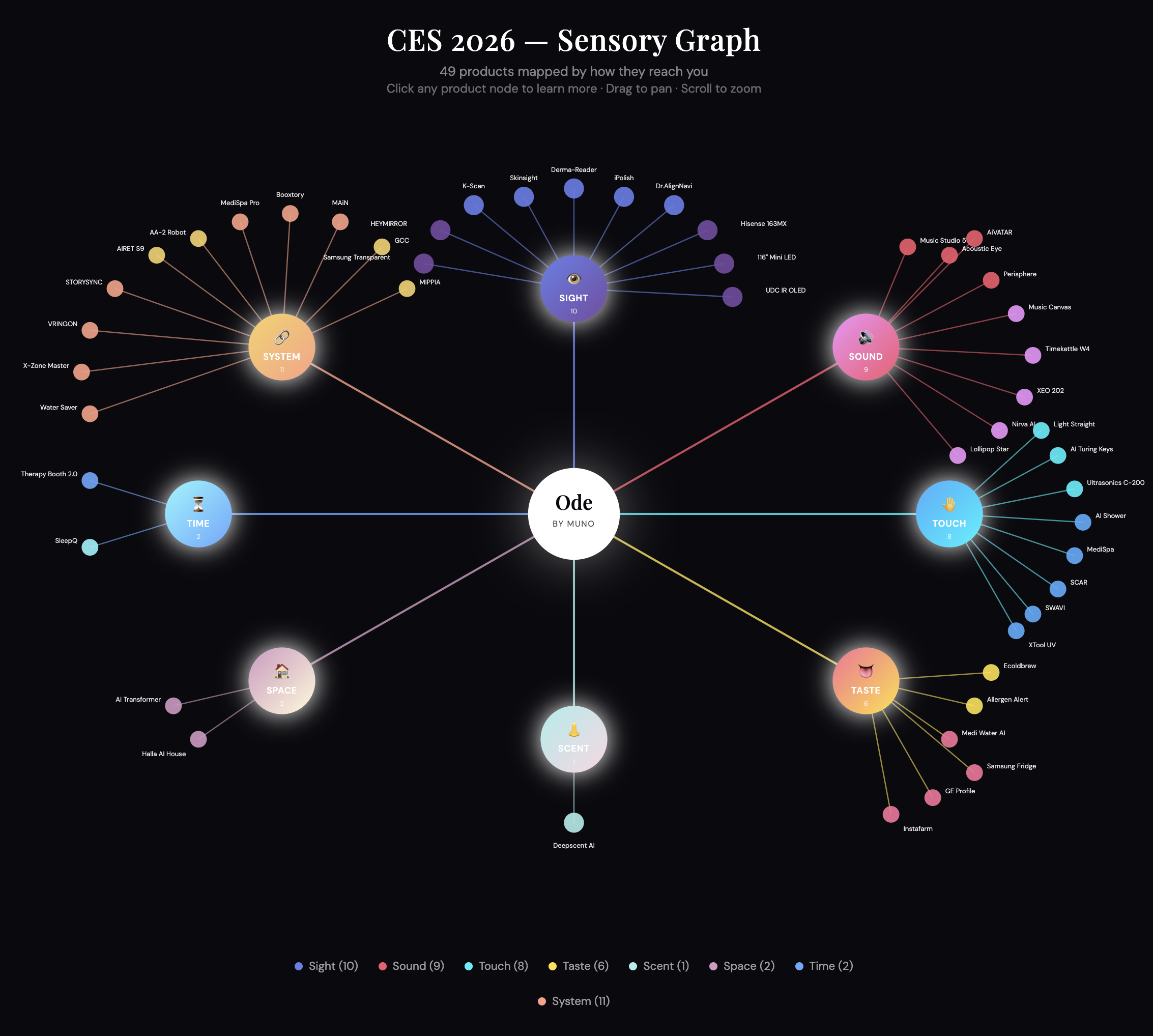
What This Is
This is an ode to how we perceive and make meaning. Every product at CES promises to change your life, but they all have to reach you somehow, through your senses, your environment, or the invisible systems running in the background.
This map organizes 49 products into 8 categories:
| Sense | Products | What It Covers |
|---|---|---|
| 👁️ Sight | 10 | Displays, cameras, mirrors, imaging |
| 🔊 Sound | 9 | Speakers, translation, audio AI |
| 🤚 Touch | 8 | Wearables, grooming, haptics |
| 👅 Taste | 6 | Food tech, hydration, kitchen AI |
| 👃 Scent | 1 | Aromatherapy, fragrance |
| 🏠 Space | 2 | Smart homes, transformable environments |
| ⏳ Time | 2 | Sleep, recovery, therapy |
| 🔗 System | 11 | Hubs, robots, connectivity |
How To Navigate
The Graph
Pan — Click and drag anywhere on the background to move around
Zoom — Scroll (mouse wheel) to zoom in and out
Mobile — Pinch to zoom, drag to pan
Clicking Nodes
There are three types of clickable elements:
Center Node (Ode by Muno) — Click to read the philosophy behind this map
Sense Nodes — The 8 colored circles around the center. Click any to read analysis of that sensory category, what stood out, what the opportunities are, and what the challenges might be.
Product Nodes — The smaller circles at the edges. Click any product to see:
What it is (detailed description)
Value proposition
Why it matters
Skepticism (critical perspective)
Link to learn more
Closing Modals
Click the × button
Click outside the modal
Press Escape
Credits
Created by Muno.
Data sourced from CES 2026 Innovation Awards and product announcements.