Ode Logo Explained
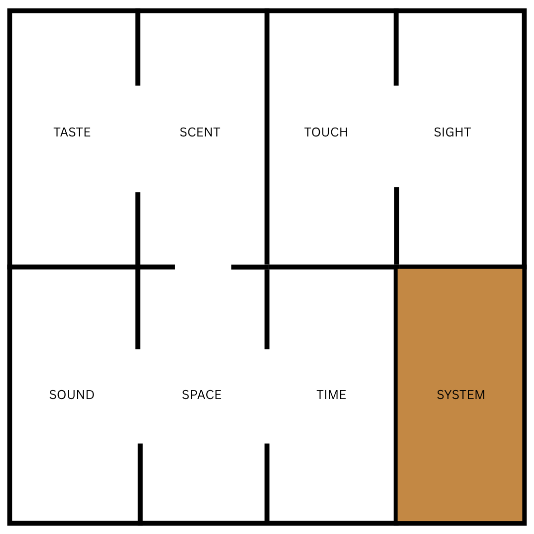
This grid represents the eight perceptual systems we explore at Ode — but the real work happens in the spaces between them.
Those black lines aren't just dividers. They're channels, mapping how information flows between different ways of sensing. An open divider signals a direct connection, where two senses communicate naturally. A closed divider marks a boundary, where translation is needed for information to pass through.
Taste and scent share an open channel — they're so intertwined that one barely exists without the other. But taste and sound? Closed. They generally operate in different dimensions.
System holds its own space. It's not just another sense but the meta-sense: the one that recognizes patterns across all the others, sees the feedback loops, the hidden architecture. Both part of the grid and operating above it.
Here's what matters: this mapping is subjective. My boundaries aren't yours. The way sound and space interact for you might be completely different than how they work for me. Maybe your sense of time bleeds into everything else. Maybe touch and sight are more connected in your experience than the grid suggests.
That's why there are no labels on the actual logo. The flow of information is personal. The grid doesn't dictate — it invites you to locate yourself within it, to trace your own channels of perception.
Think of it as a framework. A starting point for noticing how you process the world — which senses naturally speak to each other in your experience, and which ones require conscious effort to connect.
The architecture of perception isn't fixed. It's dynamic, fluid, yours.
How would you draw your own lines?

